
The visualization project which I will detail here is what allowed the team to get buy-in from upper management to enact our proposed Entity Resolution changes detailed here.
When JPMs Entity-Resolution process run it generates a lot of tables. In this output are the ‘matches’ between different source records implying that they are the same entity (Cluster ID). When there are dozens of sources, it can be difficult for person to translate in their head how everything is coming together from a graphical perspective.

There are many more tables that represent different rules which are executed during the Entity-Resolution process. The two examples to the right (middle and bottom) are duplicate identification and source removal.
This Entity-Resolution process produces foundational data which is consumed by dozens of teams at JPM. It’s crucial that the data our team produces is accurate. Before we could start making changes to the process, we need to figure out where it could be improved. To figure this out we need to better understand its behavior. I saw the value this could bring and took it upon myself to prototype a UI on the side.
My first version of the build only produced an image of a graph but absent of a UI. I had previously only worked on modeling and back-end computation but I knew to get buy-in I would need a UI, so I decided to roll up my sleeves (and consult ChatGPT) to wrap a UI around the backend graph building script.
The UI allows a user to select different run dates (Entity-resolution process produces results weekly) which allows them to see how the entity has evolved over time. The UI connects to AWS to retrieve all the information required to populate the graph.
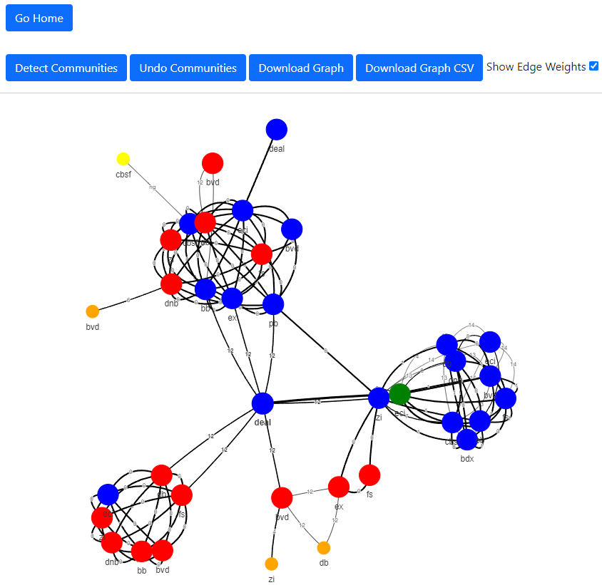
The user is then presented with a graph where each node represent a record brought together in the entity resolution process and each edge represent the connection strength between the records.
The different coloring on the Nodes informs the user of how the records were considered during the cluster formation process.
Green = Center of mass, record chosen to be the main representative for the entity
Red = Record was brought together during Entity-Resolution but then removed due to business logic
Blue = Record is part of the main cluster
This visual, graphical representation made it much more clear where the process was having issues:
There are clearly distinct ‘communities’ being brought together by bad connections
The business logic is sporadically kicking records out of Clusters
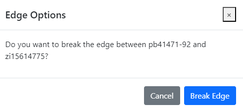
I also built in additional functionality that was not supported by the pyvis package which used to generate the graph. One of these functionalities was the ability to remove/cut edges. This allows a user to experiment which would happen during community formation if certain edges were removed. This is much easier to understand with the tool rather than parsing multiple data tables.
Next Steps

Allow authorized users to have their edits to the graphs processed straight through into the entity-resolution process
Set up infrastructure to host UI rather than running on a local port
Allow for multiple graphs to be visualized at the same time

Impact
Upper management signed off on a proposed change to enact Community Detection
Validation teams that trouble shoot ‘faulty’ entities and provide manual overrides produce changes 5X faster
Tool will be productionalized according to ‘next steps’ and rolled out to relevant teams at JPM

Lessons Learned
Graph takes a while to build, while I did build in a caching functionality, hydrating would be better for users
I used flask to build the tool, however if I were to rebuild it I would work in something like react